Formatting instructions (using Microsoft Word as an example)
Content
- General information
- Prepare text for typesetting
- Set up page
- Pagination
- Fonts and spacing
- Paragraph formatting
- Footnote settings
- Column title
- Illustrations / Graphics
- Tables
- Table of contents, list of figures and tables
- Index (index of persons, places, subjects, etc.)
- PDF settings of your software
- Final check
- Checklist for checking the formatting
Detailed instructions on Microsoft Word functions can be found in manuals and on the Internet, e.g. at:
- https://support.microsoft.com/en-GB/word and
- https://www.studium-und-pc.de/ (in German).
If you use a different typesetting or word processing programme, please adjust the settings according to our specifications.
In order to publish your work in our font series, a number of formatting specifications must be observed. Page structure, layout, fonts and font sizes are of course also a matter of personal taste. Our suggestions are intended to ensure that your publication runs as smoothly as possible and that the layout results (and any subsequent printing results) are optimised.
General information
Mandatory settings emphasised by orange and bold formatting of the headings and a different font in the body text.
In order to reformat your document more easily and quickly, we recommend using style sheets. This ensures that the formatting of headings and body text, citations, footnotes and, if applicable, tables is standardised. The use of style sheets is also crucial for accessibility! For more information on the settings of style sheets, we recommend that you refer to:
- Wie Word Sie mit Formatvorlagen bei der Strukturierung Ihrer Texte unterstützt (in German)
- Apply styles
- Customize or create new styles
Please always use a copy of your original file so that you can fall back on the original if necessary.
Prepare text for typesetting
Spaces / blanks
- Use only one space at a time. Too many spaces disrupt the sentence structure. You should replace two spaces with one using search and replace; repeat this process until there are no more search results.
- Make sure that there is always a space after each punctuation mark (full stop, comma, colon, semicolon, exclamation mark, question mark) and not before.
- Parentheses are always placed without spaces (yes!).
- Please never use spaces, e.g. to centre text passages or to create spacing. These spaces can lead to inconsistencies in the layout.
Blank lines
A blank line, i.e. a line without content that separates two paragraphs, serves a specific purpose: it separates different contexts in terms of time, content or space and stops the flow of reading. You should therefore only use blank lines when they are absolutely necessary.
Blank lines are particularly problematic for accessibility, so work with (page) breaks instead!
Indentations / tab stops
Do not use spaces instead of tab stops.
If you want to indent the first line of a paragraph, you can specify the indentation in the paragraph format. According to old typesetting custom, the beginning of a paragraph preceded by a blank line is not indented. This rule does not have to be adhered to, it is only a recommendation (Fig. "Indenting the beginning of a paragraph").
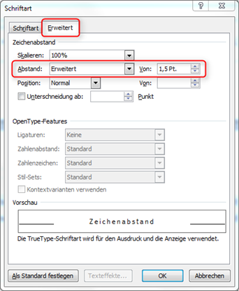
Locked text
If you want to s p a c e text (i.e. increase the character spacing), please do not use spaces between the letters! This leads to problems with pagination. Change the character spacing via the font menu (Fig. "Adjusting the letter spacing").
Call sign, question mark, dot
Maximum three in a row!!!
Dashes
Make sure that the dashes (also known as semicolons) are displayed correctly. If necessary, insert the dashes manually via the menu Insert / Symbol / Special characters or with the key combination Ctrl+Num- (this means that you press the Ctrl key and the minus key of the numeric keypad (!) at the same time). You can find an overview of the most important key combinations at Keyboard shortcuts in Word and Keyboard shortcuts to add language accent marks in Word and Outlook, for example.
Dashes and other special characters should not be placed at the beginning of a line.
Inverted commas
There are different types of inverted commas. In German sentences, there are two variants: "..." (goose feet) and "..." (seagulls, the tips point inwards). Half inverted commas '...' or '...' are used within normal inverted commas or in linguistics to indicate meaning.
Regardless of which variant you use in your document: Please ensure that opening and closing inverted commas are set clearly and correctly.
Hyphenation
Switch on automatic hyphenation. With justified text, it minimises larger spaces between words.Please always deactivate hyphenation in the headings!Do not force hyphenation by inserting a hyphen/minus sign! This character will not disappear, even if the hyphenated word is no longer at the end of the line.You can force a clean hyphenation manually with Ctrl+minus sign in the main block (!) of the keyboard.
Hyperlinks
If web links are wrapped (e.g. in footnotes or in the bibliography), you should insert the so-called conditional zero-width change at suitable points in the link so that the wrap looks better in justified text but the link address is not changed. You can find this function in Word in the Insert / Symbol / Special characters menu.
"Flyspeck"
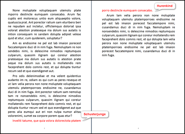
This is a single syllable or number that appears alone in the last line of a paragraph or footnote. These technical errors should be avoided at all costs.
Set up page
Your document must be set up appropriately for publication. To ensure that there are no "losses" when binding and trimming the printed sheets and that the text is easy to read, certain minimum dimensions must be observed for the page layout and for fonts, which differ depending on whether the document is created in DIN A4 or DIN A5 format. Which format you choose is up to you.
> Tip:
If your document is already laid out in A4, stick with it and note the information in the corresponding column. It is not necessary to convert the document to A5. The scaling is done by the publisher.
Page setup
|
|
|
|
|
|
|
|
|
|
|
|
|
|
|
|
|
|
|
|
|
|
|
|
|
|
|
|
|
|
|
|
|
|
|
|
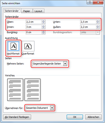
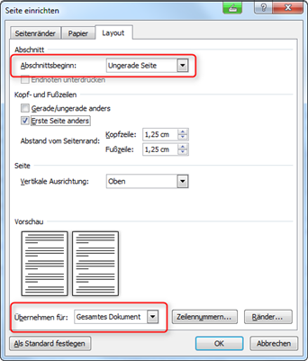
In Microsoft Word, you must define these settings for the entire document:
- in Word 2003 in the menu File / Page layout;
- in Word 2007 and later in the Page layout / Page setup menu (Fig. "Setting up the page").
For footnotes, you can adjust the distance from the page margin in the same menu under the layout tab.
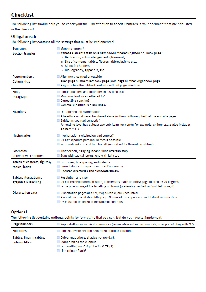
As a rule, the foreword, table of contents, main chapters, bibliography and appendix each start on an odd-numbered (right-hand) page.
To ensure that the individual sections automatically start on an odd-numbered page, make the following setting for section breaks (Fig. "Setting up the heading on an odd-numbered page"):
- Under the layout tab, set "Odd page" as the section start.
- Apply this setting to the entire document.
Pagination
You are free to use any combination of Roman and Arabic pagination. The pages before the start of the actual text, e.g. tables of contents or tables of figures, are numbered consecutively using Roman numerals. The main text, bibliography and appendix are numbered consecutively in Arabic numerals.
All pages that precede the table of contents (dedications, acknowledgements, etc.) should be numbered but not paginated. If such texts appear on only one page, this should also be a right-hand page and the reverse side should be left blank if necessary.
> Tip:
A section break to an odd-numbered page may automatically create a blank back page.
For dissertations
For dissertations, a dissertation title page and, if applicable, a curriculum vitae must be included. These pages are generally not counted, as they are removed for the book trade edition or are only printed in the deposit copies for the dean's office and university publication centre. Please design the dissertation title page according to the specifications of your department. The names of the reviewers and the date of the examination should appear on the reverse (preferably in the bottom quarter of the page).You can also submit the dissertation title page including the reverse side and the CV in a separate PDF file without page numbering. We will then insert these pages into the book block in the designated places.
As the book is printed double-sided, we recommend positioning the page numbers on the outside: the odd-numbered pages on the outside right and the even-numbered pages on the outside left. Alternatively, the page numbers can also be centred. They are usually integrated into the header or footer.
Fonts and spacing
Fonts and sizes
Font size comparison for different fonts
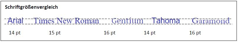
The font sizes we recommend (Tab. 2) apply to fonts that are roughly the same size as Arial or Times New Roman, for example (Fig. "Comparison of font sizes for different fonts"). If you are using a different font, please adjust the values accordingly. An overview of the most common fonts can be found at the end of this document.
For body text, we recommend serif fonts such as:
Serifs emphasize the baselines and improve legibility. Sans serif fonts are less suitable for reading body text, but very suitable for headlines. Examples of sans serif fonts are:
Italic and bold emphasis are possible for headings and in the main text. Underlining, on the other hand, is rather unusual. You should also not use more than two fonts at the same time and they should be easily distinguishable, for example a sans serif and a serif font.
If you are an employee of the University of Münster and are planning an institutional publication, you may be interested in the house fonts (sans serif font) and Adobe Garamond (serif font). Please note that some special characters may not be displayed correctly in the Meta font.
Further information can be found at Corporate design of the University of Münster.
Font sizes
|
|
|
|
|
|
Exception: smaller up to 12 pt |
|
|
|
|
|
|
|
|
|
|
|
|
|
|
|
|
|
|
|
|
|
Paragraph formatting
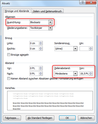
For the publication series, the body text and footnotes must be formatted in justified text.
Widows and orphans
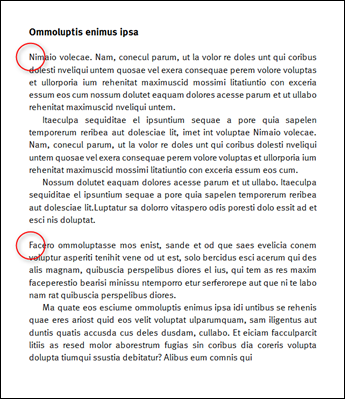
"Widows" and "orphans" are terms used in typesetting and printing. An orphan is the first line of a paragraph, which stands alone at the end of a page and is then wrapped. The opposite is the case with the orphan: it is the last line of a paragraph, which is also the first line of a new page. (Fig. "Widows and orphans"). To avoid such paragraph separations, activate the Paragraph control option under the Line and page break tab (Fig. "Formatting the headings"). This will keep at least two lines of a paragraph together.

Headings
Please align the headings to the left. Make absolutely sure that a heading never stands alone at the end of a page. To achieve this, activate the Do not separate from next paragraph option under the Line and page break tab for all headings in the document (see above Fig. "Formatting the headings").
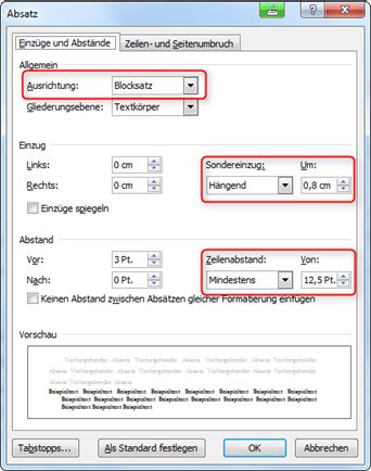
The following values have proven to be favorable for paragraph formatting:
Paragraph formats
|
|
|
|
|
|
|
|
|
|
|
|
|
|
|
|
|
|
|
|
|
|
|
|
|
|
|
|
|
|
You can change these values
- in Word 2003 in the menu Format / Paragraph,
- in Word 2007 and later in the Start / Paragraph menu.
Odd numbers for the line spacing must be entered manually (Fig. "Setting the line spacing").
Quotations
Literal quotations longer than three lines look more elegant if they are visually separated from the text, e.g. by using a smaller font (1-2 pt less than the body text size), 6-12 pt spacing before and after the quotation and a right and left indent of 0.5-1 cm.
Footnote settings
A footnote is always treated like a whole sentence or paragraph. For this reason, it always begins in capital letters and always ends with a full stop, even if it only consists of a single abbreviation (cf., ibid., p. above).
To make footnotes clear within the document, we recommend aligning the footnotes in justified text, setting line spacing to match the font size (Tab. 3) and using a so-called hanging indent.
Hanging indentation in footnotes
|
|
|
|
|
|
|
|
|
|
|
|
You only define the settings for the hanging indent for the footnotes or for the footnote format template (Fig. "Setting up the line spacing").
If there are a large number of footnotes, it is possible to restart the footnote count in each main chapter or main section.
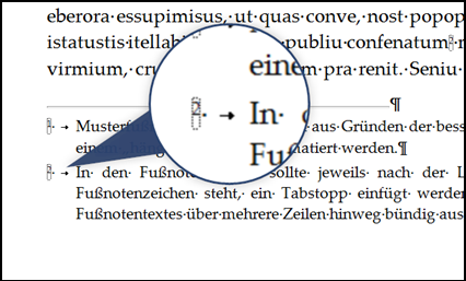
Align footnotes flush
In the footnotes themselves, insert a tab stop after the blank space after the footnote symbol so that the beginning of the footnote text is aligned across several lines (Fig. "Inserting the tab stop in footnotes").
> Tip:
For more convenient editing of all footnotes, select the Draft document view in the Word View menu. Then click on the Show notes button in the References / Footnotes References / Footnotes menu. The window is now split: In the lower section, all footnotes are displayed one below the other and can be edited more easily; this section can be enlarged or reduced in size as required (Fig. "Changing the view for editing footnotes").
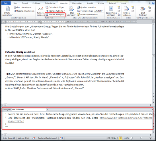
In Word 2003, you will find this document view in the Normal view menu.
Column title
Column titles can be generated automatically in Word. You can achieve this by assigning corresponding headings or outline levels - but only if you have used standardised style sheets for headings. To set up a heading as a column title, proceed as follows:r:
- Place the cursor in the header.
- In the Insert / Quick blocks menu, select the Field command.
- In the Links and references category, select the StyleRef entry and select the desired structure level as the field property, e.g. Heading 1 (Fig. "Automatic column titles").
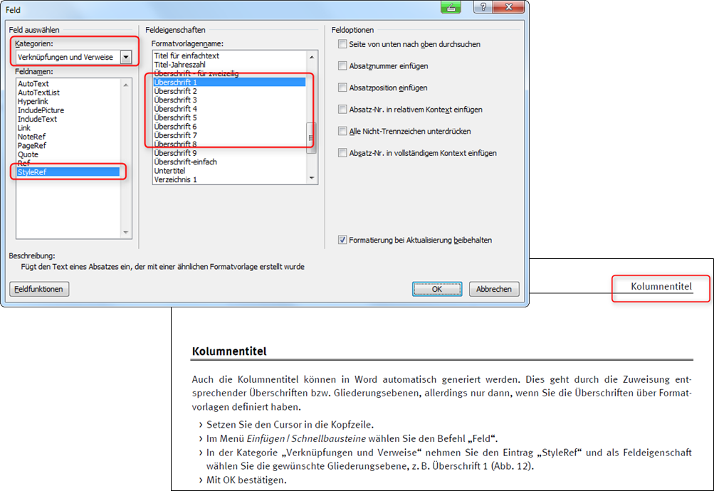
- Confirm with OK.
It is best to centre the column titles or align them on the outer edge of the page. This way, the reader can always see which chapter or section is in front of them at the top of the page.
Illustrations / Graphics
To ensure that images are reproduced correctly in print, please note the resolution requirements, the file formats that can be used for book printing and the colour space.
Resolution and scaling
Colour and greyscale images: minimum 300 dpi (optimum 600 dpi)Line drawings (black and white images): at least 600 dpi, ideally 1200 dpi mindestens 600 dpi, ideal sind 1200 dpiSize: If possible, create in 1:1; the maximum width of the illustrations must not exceed the width of the type area, i.e. in DIN A4 max. 15.8 cm, in DIN A5 max. 11.3 cm.Line widths: All lines (also in headers/footers and table frames etc.) must not be less than 0.75 pt, especially if the PDF is scaled from DIN A4 to DIN A5. The reduction in size also reduces the thickness of the lines in the entire document.Images for the cover design: Please provide us with images for the cover design in a minimum resolution of 300 dpi (dimensions: max. 14.8 cm wide and 8.5 cm high).
File formats
- for users of Microsoft Word:
- TIF (without layers), EPS, JPG (without compression! so always use the highest quality for JPG);
- Illustrations that only contain text should not be converted to an image, but left as a line drawing and saved in TIF or EPS format;
- Excel diagrams should be copied as such after formatting and pasted into Word, i.e. not converted to a graphic beforehand;
- Users of a DTP programme (e.g. Adobe InDesign) can use TIF, PSD or EPS files.
Colour space
Illustrations for book printing should be in CMYK mode and not in RGB mode. This colour format required for printing is unfortunately not supported by text editors (except LaTeX). For printing, the colours must therefore be converted from RGB (standard colour space for viewing on a monitor) to the required CMYK format. This can result in colour changes - especially with shades of grey, e.g. with table backgrounds. Unfortunately, test printouts with a home printer are not meaningful, as these use completely different techniques and colour profiles than the production machines at the publishing house.
Word documents can remain in RGB mode for the duration of processing. When the PDF file is generated, the entire document can then be converted to CMYK. There are corresponding setting options for this in the PDF programmes (see our instructions for PDF creation).
When using a DTP programme (e.g. Adobe InDesign), please always select CMYK.
Labelling and lists of illustrations
Use Word's automatic function for labelling figures, tables or formulas, e.g. to be able to refer to these elements elsewhere in the document. When adding or moving images or tables, Word automatically adjusts the labelling and the reference points in the text. The labelling function can also be used to create lists of figures and tables. You can customise the formatting of captions and lists of figures and tables using the corresponding style sheets.
> Link-Tips:
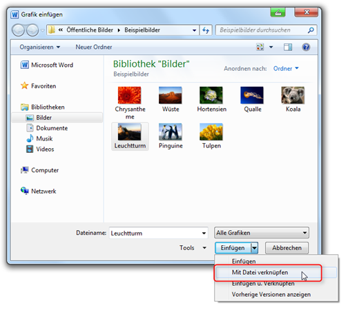
When working with a large number of graphics, it is recommended that you do not use the Insert / Graphic / Insert command to place the images, but instead use the Insert / Graphic / Link to file command (Fig. "Linking files"). This saves a lot of memory space! The folder with all linked images must then always be in the same position in relation to the main (text) file until the PDF is created.
Tables
Tables must be formatted so that they match the type area. If you import tables from other applications, e.g. Excel, into Word, the same specifications apply.
For tables that have visible frame lines, please ensure that the minimum line thickness is 0.5 pt. The colour of the lines should be as pure black as possible, no shades of grey (they often cause problems in printouts).
Table properties
|
|
|
|
|
|
|
|
|
|
|
|
|
|
|
|
|
|
|
|
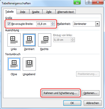
You define these settings under Table properties. Select the entire table, then call up the Table properties context menu with the right mouse button and activate the Preferred width option to determine the table size. To select and change the settings for table borders and colour, select Borders and shading ... (Fig. "Adjusting the borders and shading").
In order for tables to be displayed correctly, all lines must be actively formatted, otherwise cell borders will not be visible in the printed work. It is also important to fill cells with light colours or colour gradations of up to 40 % to ensure a pleasant typeface. For darker cell backgrounds, use white lettering if necessary.
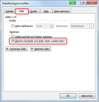
If a table does not fit on one page, it must be divided accordingly. Row headers should then be repeated if possible. In this case, activate the Repeat the same header row on every page option in the Table properties context menu under the Row tab (Fig. "Header row of a table").
In the case of full-page tables on landscape pages, these pages must be rotated by 90° after the PDF has been created and the page numbers in the PDF file subsequently removed, added or adjusted using the Acrobat Professional text editing tool.
Table of contents, list of figures and tables
It is recommended to work with the function of an automatically generated table of contents. This makes it much easier to adjust the page numbering if page breaks are changed during formatting or through subsequent corrections. Otherwise, the table of contents is only created "on foot" at the end of the formatting work.
For CVs in dissertations
The curriculum vitae (for dissertations) must not be listed in the table of contents!
> Link-Tips:
- Insert a table of contents
- Insert a table of figures (Table directories can also be inserted. Please select the type Table in the settings under General > Labelling).
Index (index of persons, places, subjects, etc.)
The creation of indexes is recommended for extensive works. Microsoft Word offers the option of creating indexes automatically. To control the entries required for this, use the Word menu References / Index (in Word 2003 the menu Insert / References / Index and Directories).
> Link-Tip:
PDF settings of your software
A PDF file generated from the word processing file of your work serves as the print template, which we forward to the publisher. It is strongly recommended that this PDF file is created on the computer on which the word processing file was edited. On other computers, the layout of the work may be displayed differently, page breaks or graphics and tables may "slip". To ensure that your work is later converted into a high-quality PDF file suitable for book printing, certain settings must be made in the programme you are using. You can find detailed information on this in our tips for creating a PDF file hier muss eine neue Seite mit der Anleitung eingefügt werden.
> Tip:
If you have defined a printer other than the PDF generator as the default printer, the page break or colour display may change when you switch to the PDF printer. It is best to set the PDF generator as the default printer for the duration of the creation and formatting of your document. This prevents possible shifts when saving as a PDF.
Final check
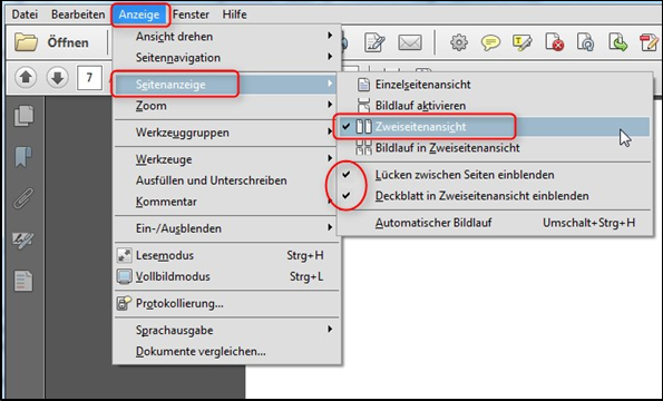
Please carry out a final check after creating the PDF file. The best way to do this is in the two-page view of your PDF reader. To set the correct view, first activate the Two-page view option in the Display / Page display menu and then the Show gaps between pages and Show cover page in Two-page view options (Fig. "Show two-page view"). This will allow you to see all pages as they will later be arranged as a book.
Checklist for checking the formatting